


Travel time maps show how far you can travel in a given time from a given location. They are somewhat similar to the more common "radius maps" but much more accurate. The most common example is "drive time maps", which are widely used in logistics, emergency response services, sales territory mapping, retail, and many more applications.
We're going to show how to generate travel time maps for public transport (also known as "public transit isochrones") networks of nearly any location worldwide. Public transport isochrones are very powerful and underestimated tool that can be leveraged by the public sector, real estate, and travel industries.
Our technology can compute travel time areas for different transportation modes, including walking, driving, and public transit, and for nearly any place in the world.
If you're not new to travel time analytics and just need to get the job done, please feel free to jump straight to the step-by-step instructions:
- How to generate a public transport isochrone with CommuteTimeMap? - create and share travel time maps with our free app.
- How to compute public transport isochrone polygon with API? - for advanced usage and software integration.
What is a "travel time map" anyway?
Travel time maps (also known as isochrones, catchment, or service area maps or polygons) tell you how far you can travel in a given time from a given location. To illustrate why and how they are useful let's take a couple of examples.
Have you ever wanted to know what is reachable within, let's say, one hour from a hotel where you stay? Or maybe where could you possibly rent a flat to have good commute times for you and your family? Frequently such decisions are made without much system - you ask someone for a recommendation, follow what you already know, or just choose one of the first available options.
But what if your smartphone would be able to give you not just the navigation instructions on how to get from A to B, but would be able to show all places - the whole area - you can reach within a given time? Imagine using such travel time maps to look up and highlight places or facilities of interest that are reachable from, and not necessarily close to, your location.
For example, take a look at this map of medieval castles reachable within one hour by public transit from Freiburg, Switzerland:
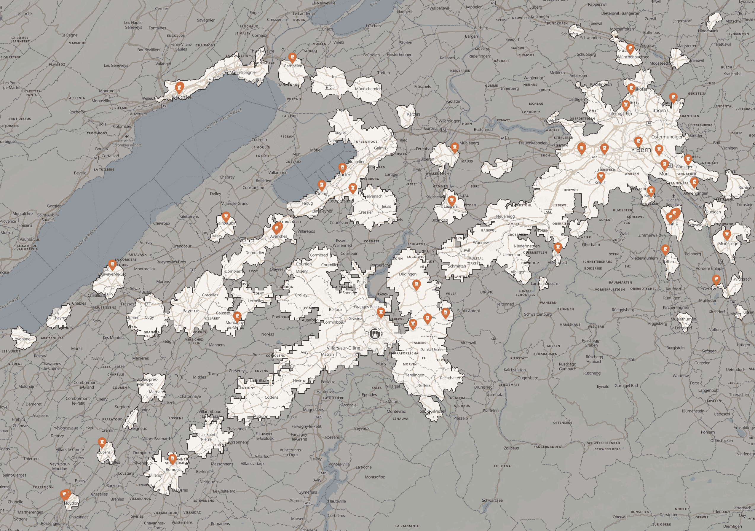
Did you notice the reachability "spots" near the train stations and how some seemingly "far" locations are much more accessible than others, geographically closer places?
Wouldn't such functionality be cool and convenient in a travel or navigation app?
We believe it would, and proud to present the next step towards more accurate and global travel time maps for public transportation. Our maps are not just more precise and have significantly better coverage than alternatives, but also more flexible and can be easily integrated into any application.
Please check our post 10 ways to use travel time maps for more examples.
What's wrong with the existing solutions
Historically travel time and reachability analysis was mostly focused on driving - mainly cars and trucks. Support for multimodal public transportation was poor or missing. One of the top reasons for this is the limited availability of official public transit data. They are generally available only for some transportation agencies and a limited number of locations.
Poor data coverage and restrictive usage terms
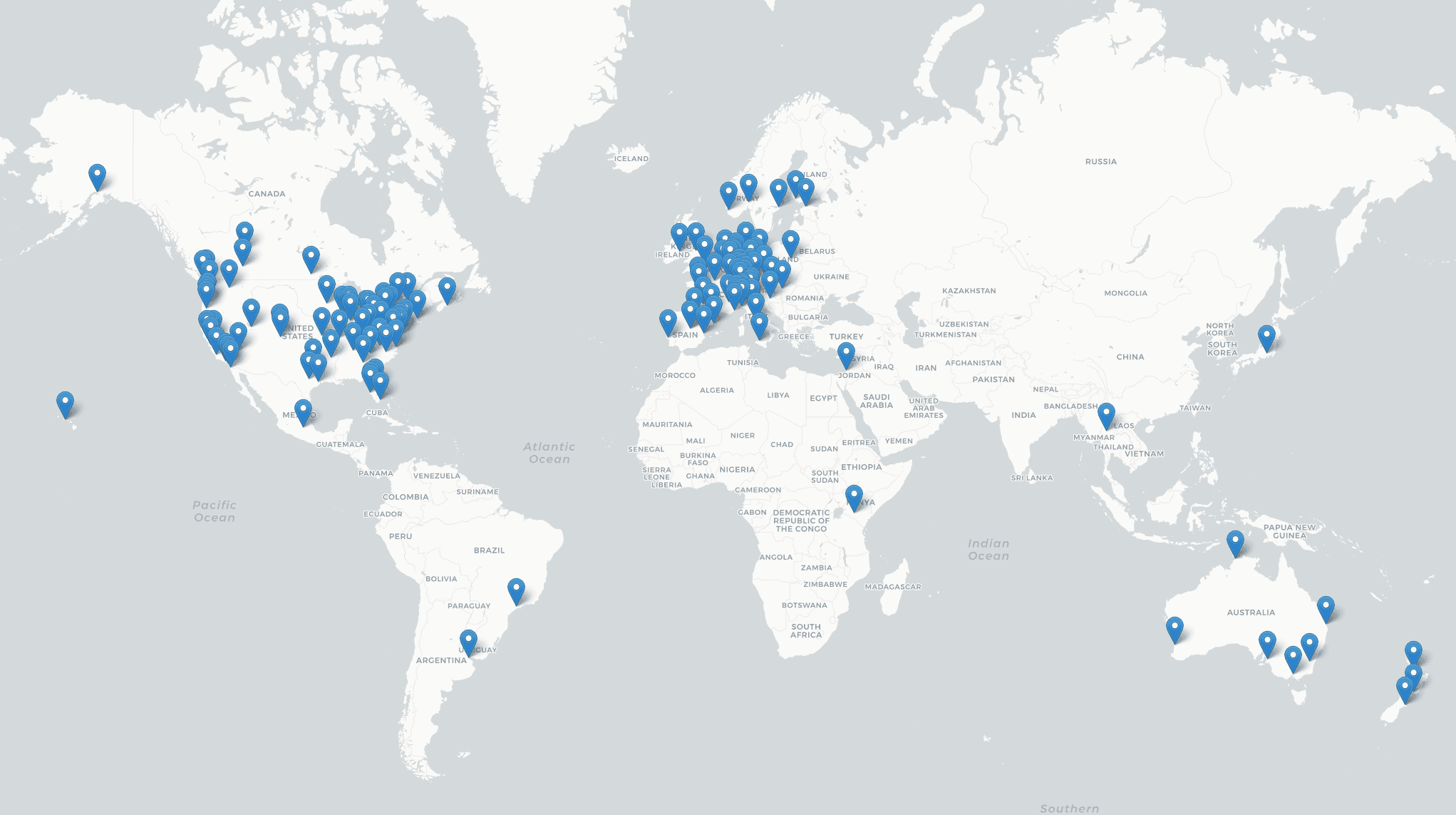
Take a look at the current public transportation data available worldwide, according to the transit.land global transit data catalog.
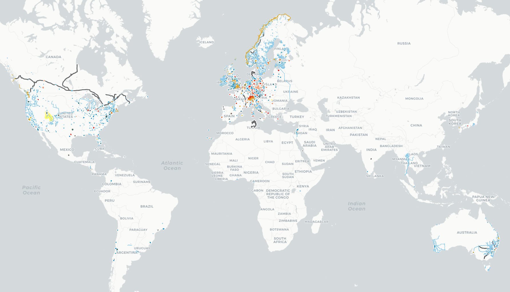
As of January 2021 transit.land has data for over 2,500 public transportation operators in over 55 countries. Yet, as you can see, the global data availability map is still pretty empty, and most countries and locations in the world are not covered.
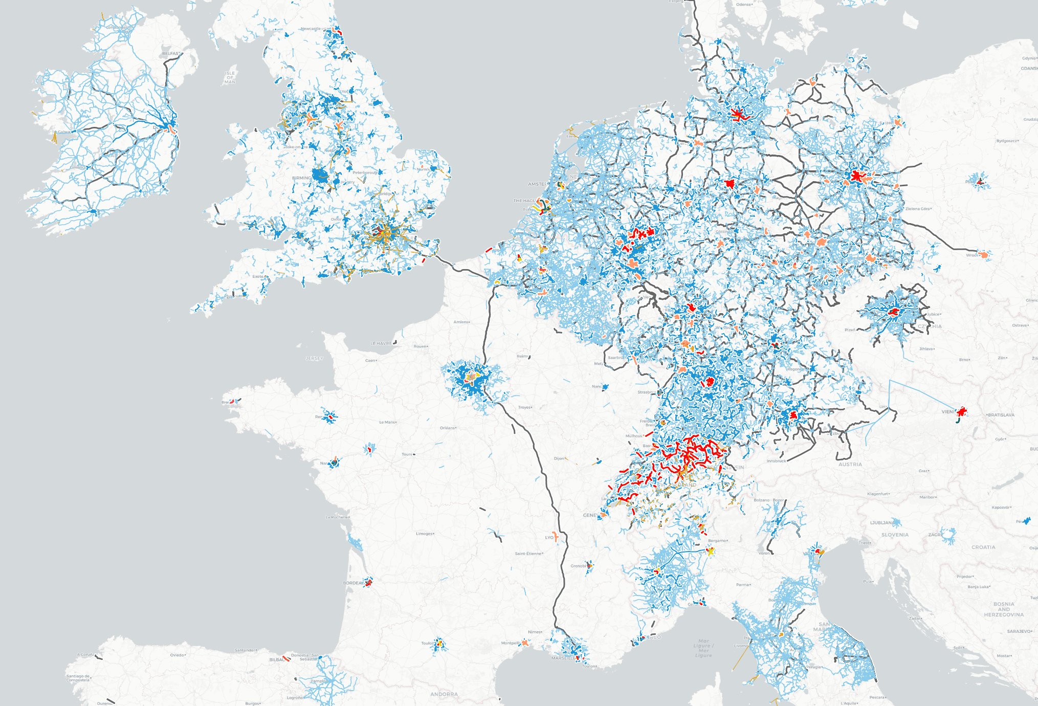
And even places that look relatively well covered on the world map. Europe for example have only very fragmentary coverage when we look closer:
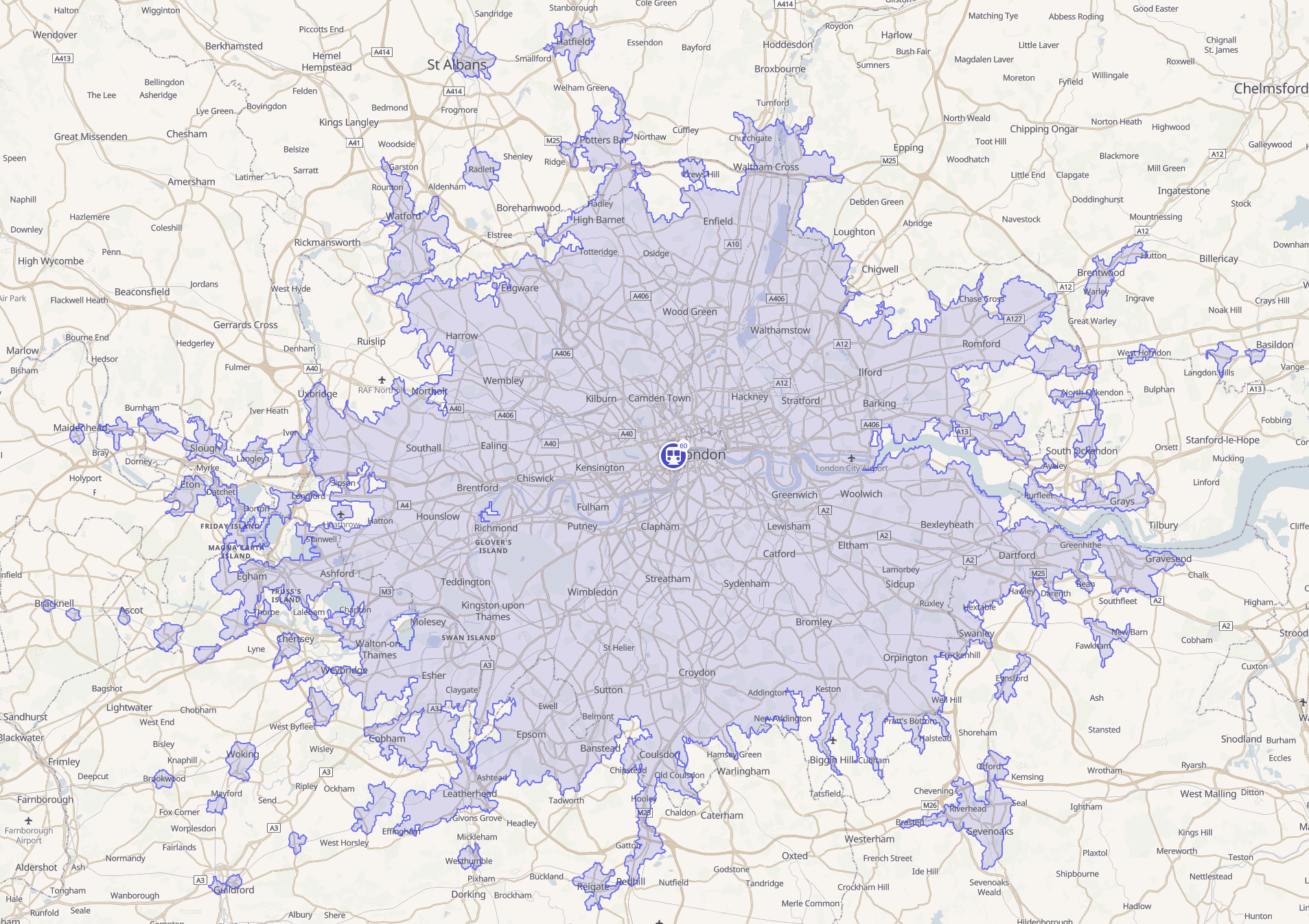
Due to this all existing solutions that are based on publicly available public transportation data are only useful if you're computing a travel time map for a well-covered metropolitan area like London or Zurich.
It worth mentioning that some providers, notably Google Maps platform, have data exchange agreements with some public transportation agencies and therefore can offer better coverage. But even the Google Maps dataset has more white spots than covered areas. Also, the Google Maps platform is so well suitable for analytics due to missing Isochrone API, restrictive usage terms, and one of the highest costs per API request in the industry.
Alternative approach to public transit analytics
We see the situation with public transportation reachability analytics as both controversial and unfair. In the end, what is the most common transportation that most of use daily? We believe that more often than not this will be public transportation, possibly combined with driving or bike-sharing.
And we're not the first to see it this way!
Travel time maps based on approximated data
A notable example of the project that tries to address that shortcoming is Mapnificent - a website that "shows you areas you can reach with public transport in a given time". Mapnificent uses community maintained extracts from official and unofficial public transportation datasets. It uses averaged travel times between stops to calculate reachable locations and then approximates "walkable" areas around and between stops with simple radius maps.
As of 2021, Mapnificent offers travel time maps for public transportation networks of 130+ cities around the world.
Despite its simplicity, the approach used by Mapnificent is capable of producing travel time maps that are sufficiently accurate to be useful for analytical purposes.
Improving approximated transit coverage and accuracy
Inspired by this, we applied our expertise and technology capabilities to get even more accurate travel time maps and achieve better coverage. And, after many experiments, we believe we're on the right track to offer truly global support for accurate public transportation isochrones, worldwide.
Take a look at the example map below. It compares travel polygons depicting 30 minutes of travel time via the Berlin public transit network, and based on three different sources:
- official transit data (gray)
- Mapnificent (white)
- our new "approximated transit" (green)
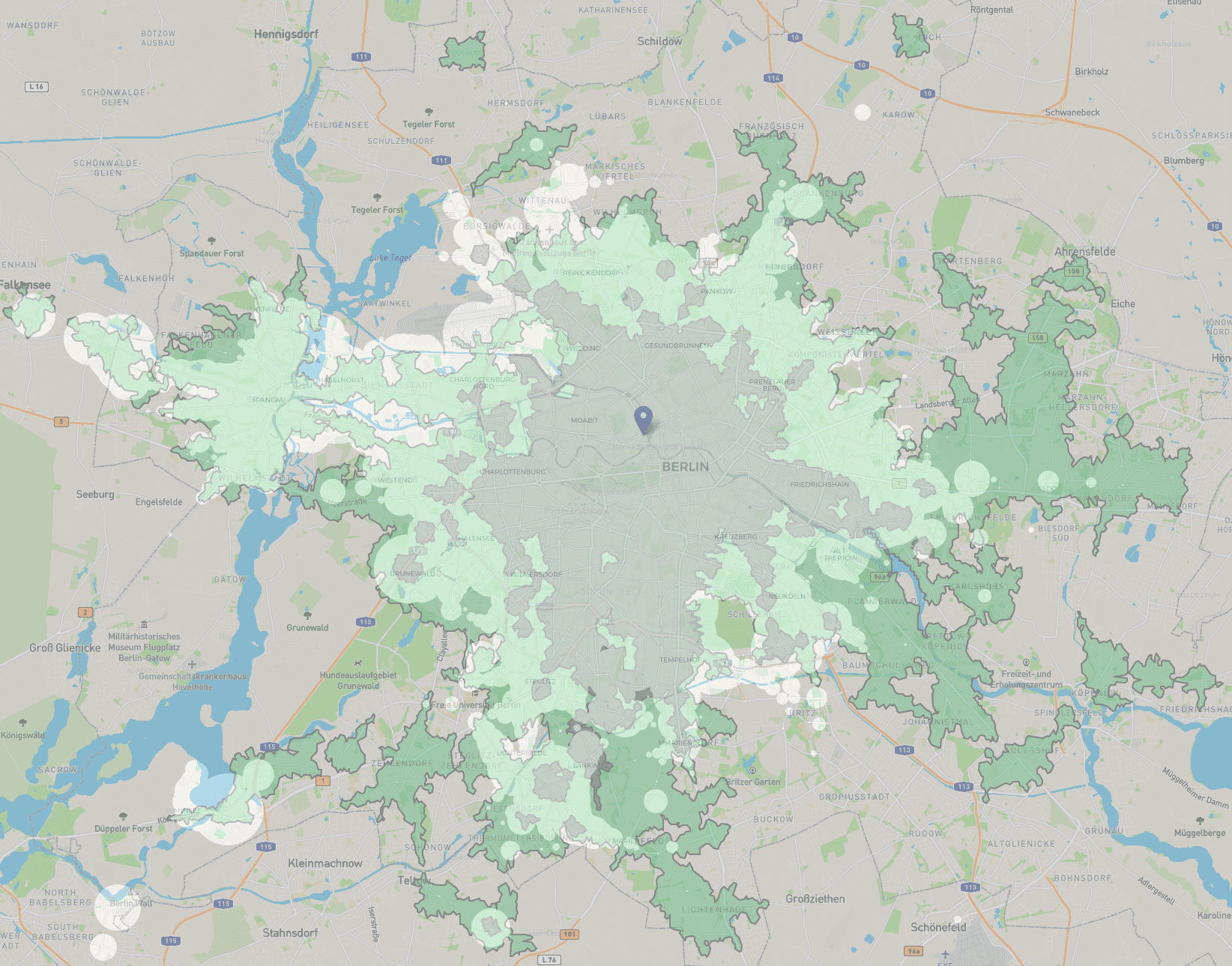
As you can see, even the current early version of approximated transit data (green area) is capable of generating more complete and precise travel time maps than what was possible before.
Our approximated public transit dataset is calculated based on several data sources:
- Open Street Map which has over 5,000,000 contributors and can be used as global geodata source for public transportation routes and stops
- Route and stop data extracts from the official and unofficial GTFS feeds
- Country-specific speed limits, traffic rules, and public transportation patterns and models
As of January 2021, our "approximated transit" dataset includes over 40,000 public transit operators and over 500,000 routes - a huge step forward comparing to 2,500+ operators available earlier.
Using the same technology that powers our Routing, Map matching and Places APIs we can take fragmentary and often disconnected route shapes and stops from OSM, match them to road networks and stop locations and assign schedules and speeds.
As a result, our travel time polygons are much more accurate than approximations based on straight line distance/radius maps, as the real road network is taken into account. For example, our algorithms will not allow a bus route to "jump" over unpassable barriers, or cross rivers without a bridge or tunnel. They also take into account factors like one-way roads, illegal turns, road classes, and speed limits.
Even in its first version, approximate public transit already offers a very decent worldwide coverage, and we hope that it will help to make public transportation isochrones much more accessible and easier to use than ever.
Two Approaches to Public Transport Travel Time Maps Generation
Depending on your needs and requirements we offer the two main ways to generate public transport isochrones:
-
Using a free CommuteTimeMap web application that offers an easy and visual way to analyze reachability areas and amenities within them. It uses our Isoline API to compute isochrone polygons, and Places API to search for places and amenities within them.
-
Using Isoline API for more advanced usage scenarios, when you need to have fine-grained control or want to integrate isochrones into your application or website. All you need to do is to get your free API key at Geoapify MyProjects and learn how to use Isoline API at API Playground and Documentation portal.
How to generate a public transport isochrone with CommuteTimeMap?
Our free CommuteTimeMap web application is one of the easiest ways to generate public transportation travel time maps for one or several locations. It also allows you to search for different places and amenities within the computed reachability areas.
CommuteTimeMap is a great option if you want to quickly check the public transportation coverage in your area and experiment with proximity analysis.
1. Open CommuteTimeMap.com
CommuteTimeMap is designed to be easy and straightforward to use. It is available at CommuteTimeMap.com
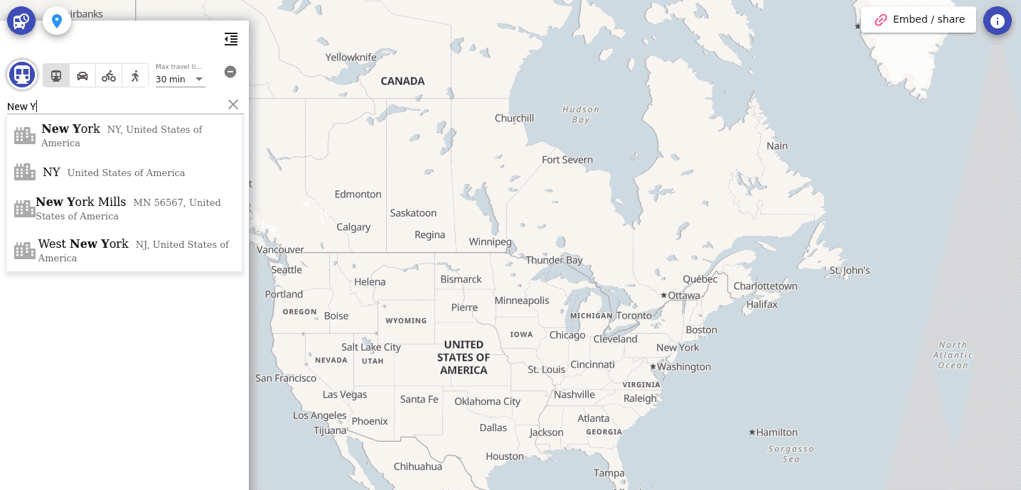
2. Select a location on the map or enter the address
You can either just navigate to the area of interest and click on the map, or enter the location address:
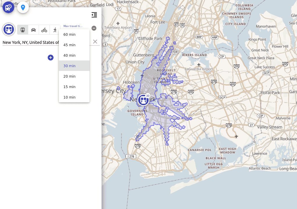
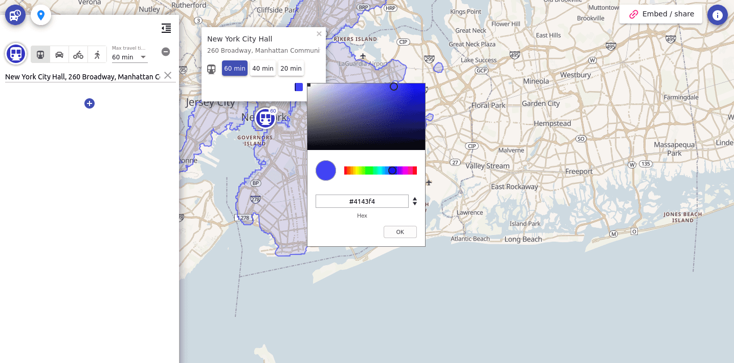
3. Adjust travel time and visual style if needed
By default, CommuteTimeMap will compute a 30 minutes isochrone from the selected location and will assign a random unique color to the isochrone polygon.
You can change the maximum travel time using a dropdown list
To change color, please click on the location symbol on the map, and then click on the color picker element
4. Show places and amenities reachable within the area
For each computed reachability area, you can filter for the number of touristic, entertainment, accommodation, transportation, and other places and amenities.
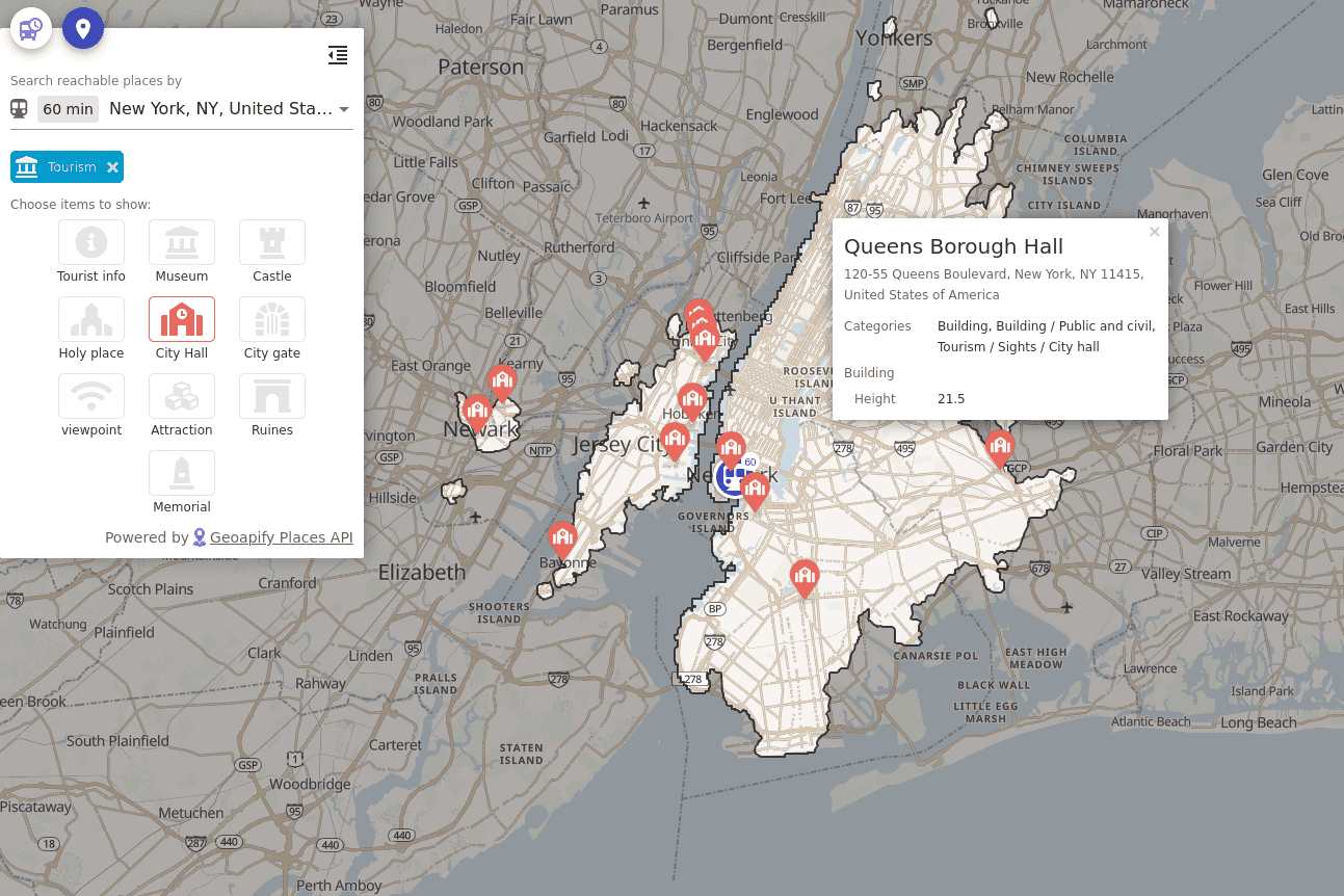
All you need to do is to switch to the "Places" tab and select the place type and category.
5. Add more areas or compare different travel modes
Apart from approximated public transit, you can choose from driving, walking, and bicycle travel modes.
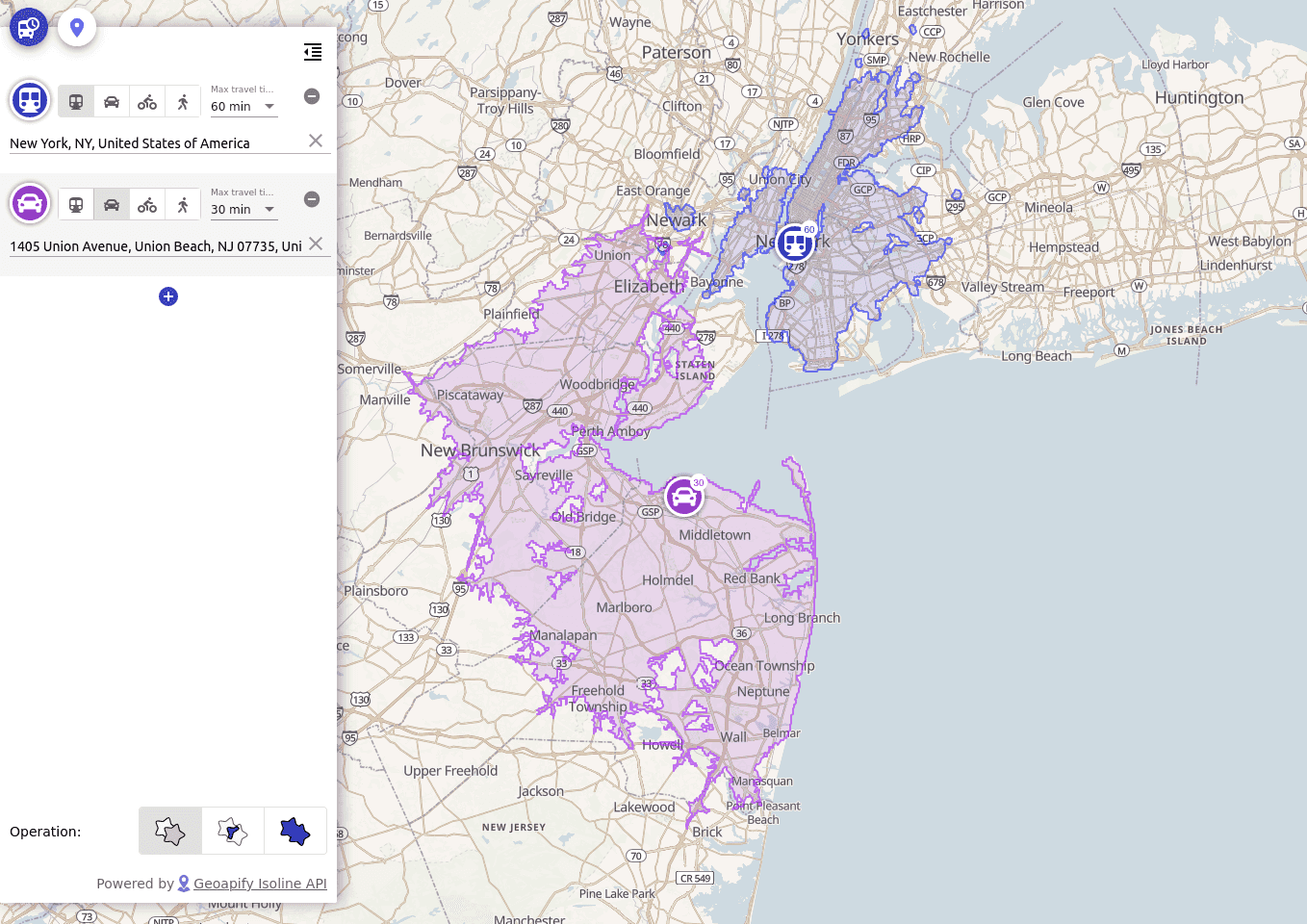
When the map contains multiple overlapping reachability areas, you additionally can compute and visualize their intersection (only common parts) and union (combination).
6. Share travel time map or embed it into your website
CommuteTimeMap allows you to share the map with your friends and colleagues or embed it into your website - like this:
Just click on the "Share / embed" button in the top right corner of the website to get the necessary sharing links and HTML code snippets.
How to compute public transport isochrone polygon with API?
Plan to generate multiple public transport travel time maps, need more flexibility, or want to integrate them into your application or website? With our Isoline API, this will be very straightforward.
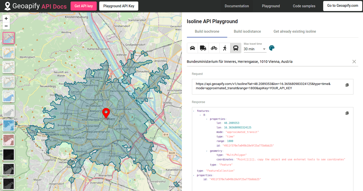
1. Open interactive API playground and documentation
Geoapify API playground and documentation are available at apidocs.geoapify.com.
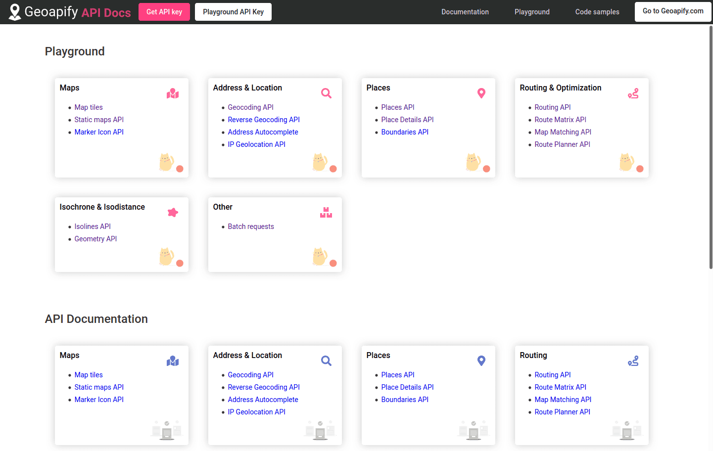
You can navigate across playground and documentation using the Documentation, Playground, and Code samples dropdown menu.
2. Open Isoline API playground page
It is also accessible directly as apidocs.geoapify.com/playground/isoline.
3. Select location, mode, and travel time
Once you click on the map or enter a location address, the Playground application will automatically generate Isoline API requests and visualize results on the map.
You can also copy the resulting GeoJSON and use it with your map, GIS software like QGIS, or an online tool like geojson.io.
4. Register and get Geoapify API key
Click the "Get API Key" button or open MyProjects page and proceed with the registration.
Once registered and logged in, click "Add project" and enter the project name - e.g name of your app or website.
By default, the project will have one pre-configured API key. You can always add more keys later if needed - for example, to distinguish development and production keys.
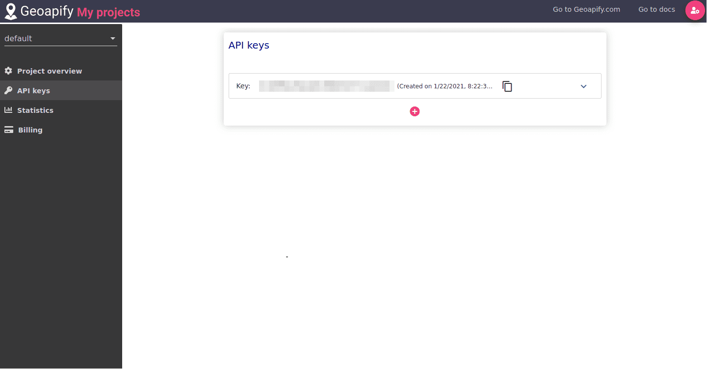
Apart from API key management, the project management page allows you to check the usage statistics and activate billing if your request volume exceeds the Free plan quota.
5. Add Isoline API to your application
Every time you test an API request in Playground you see the automatically generated request URL. Request parameters are quite self-explanatory, but you always can consult with Isoline API documentation to get more details.
Generally, all you need to do is to add the API key that you generated in MyProjects into the request "apiKey" parameter.
After that, you should be able to programmatically request computed isochrone polygons in GeoJSON format using any HTTP request library available for your programming language.
GeoJSON is widely supported by map rendering libraries like Leaflet or Open Layers, as well as all popular GIS packages and most databases.
Public Transit Isochrones: Final Words and Known Limitations
We believe that approximated transit technology is a good and necessary step towards more accessible and broadly available public transit isochrone maps.
Yet, it is important to mention that it is still in its early days, and therefore has many imperfections and we cannot guarantee the accuracy of the results. The best way to use it now is to give it a try, and let us know if you notice that approximated results are significantly off from the reality.
We will be very happy to hear your feedback and suggestions regarding possibly missing or incorrect results or future improvement ideas.
It is also worth outlining the important distinction between reachability analysis and point-to-point routing and navigation. Approximate public transit data are good for proximity and reachability analysis because they model average, general-case travel times. Navigation, on the contrary, focuses on specific routes, departure, and arrival times and is intended to provide concrete and actionable routing instructions.
While our API allows using approximated transit data for routing and navigation, you should take the results with a grain of salt. Specifically, route names and stop times may be significantly off from the ground truth. If you need to do routing and navigation please consider using the regular "transit" routing mode, based on the official public transit data.


Try Approximate Transit travel time maps now!
Build travel time maps for your city and tell us what do you think!
If you have any questions or suggestions, please do not hesitate to contact us. We will be happy to help.