


On this page
Thematic maps are a powerful way to visualize specific types of data across geographic areas — such as population density, climate zones, traffic intensity, or access to public services. They help turn raw numbers into spatial insights, making it easier to spot patterns and support data-driven decisions.
For example, urban planners use thematic maps to optimize transport routes, public health agencies track disease outbreaks, and journalists illustrate voting trends by region. These maps often combine thematic data with a geographic base layer to provide clear context and orientation.
In this guide, you'll learn what thematic maps are, explore their main types, and discover real-world examples and use cases across different industries.
What Are Thematic Maps?
A simple thematic maps definition is: maps that focus on visualizing a specific theme, topic, or dataset across a geographic area. Unlike general-purpose maps that show physical or political features, thematic maps highlight patterns or variations in data — such as income levels, air pollution, or school performance.
The goal of a thematic map is to communicate a clear message about the distribution of a particular variable. These maps are widely used in fields like urban planning, environmental science, public health, and business analysis.
Practical examples include:
- Population density maps that help city planners identify areas for housing or infrastructure development (see World Population History).
- Air quality maps showing pollution levels across different neighborhoods (e.g., EPA AirNow).
- Choropleth election maps used by media to display voting outcomes by region (see U.S. Census Bureau Median Household Income Map).
- Crime rate maps helping law enforcement allocate resources more effectively.
- Retail analysis maps visualizing store performance or customer concentration (often used in GIS-driven market research).
By combining data with geography, thematic maps turn complex statistics into intuitive visuals — making trends and relationships easier to understand and act upon.
Types of Thematic Maps + Examples and Use Cases
There are many types of thematic maps, each suited to different kinds of data and storytelling goals. Below are the most common types, along with practical examples and real-world use cases:
Choropleth Maps
Choropleth maps use color shading to represent data values across geographic regions — for example, darker colors may indicate higher population density or income. These maps are commonly used when data is tied to administrative boundaries such as countries, states, or districts.
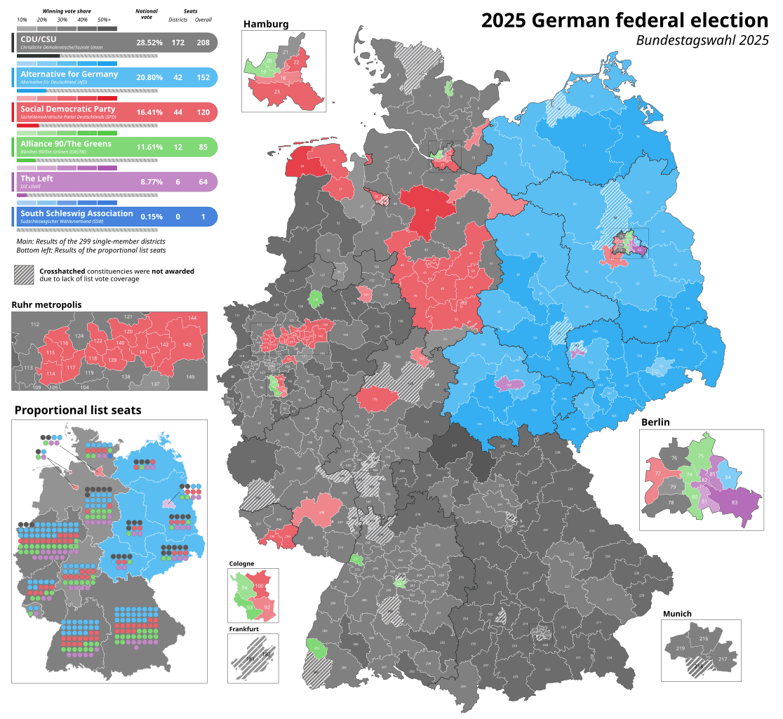
Results of the 2025 German federal election. Main map shows single-member constituencies (Direktmandate); crosshatching indicates seats forfeited under the new electoral law. Bottom left shows proportional list seats by state. Image by Erinthecute, licensed under CC BY-SA 4.0.
- A map showing COVID-19 infection rates by district, with darker shades indicating higher case counts.
- A national unemployment map highlighting joblessness levels by state or region.
- A median household income map using color gradients to show economic disparities between counties.
- A voter turnout map where intensity of shading represents the percentage of registered voters who participated in an election.
You can see a live example built with Leaflet using Geoapify services. To get accurate geographic boundaries for your own data, check out the Boundaries API. If you’re looking for a full explanation of how choropleth maps work and when to use them, this guide covers the details.
- Simple to read and understand.
- Great for comparing regions at a glance.
- Widely supported across mapping tools.
- Can be misleading when area sizes differ greatly.
- Needs careful color classification to avoid misinterpretation.
- Not suitable for exact counts or small areas with large values.
- For large regions or detailed maps, boundary data can be heavy — you may need to simplify polygons to avoid performance issues when loading on the web.
Bivariate Maps
Bivariate maps are thematic maps that display two variables simultaneously on the same map. This is typically done by combining two color scales — such as hue and saturation — so that each area reflects a combination of values for both variables.
This type of map is useful when you want to understand the relationship or interaction between two datasets across geographic space — for example, comparing income and education, or population density and access to healthcare.
Bivariate vs. Choropleth maps A choropleth map shows a single variable (e.g., unemployment rate) using a single color scale. A bivariate map, in contrast, combines two variables in a grid of color combinations, allowing both to be visualized at once — but with added complexity in interpretation.
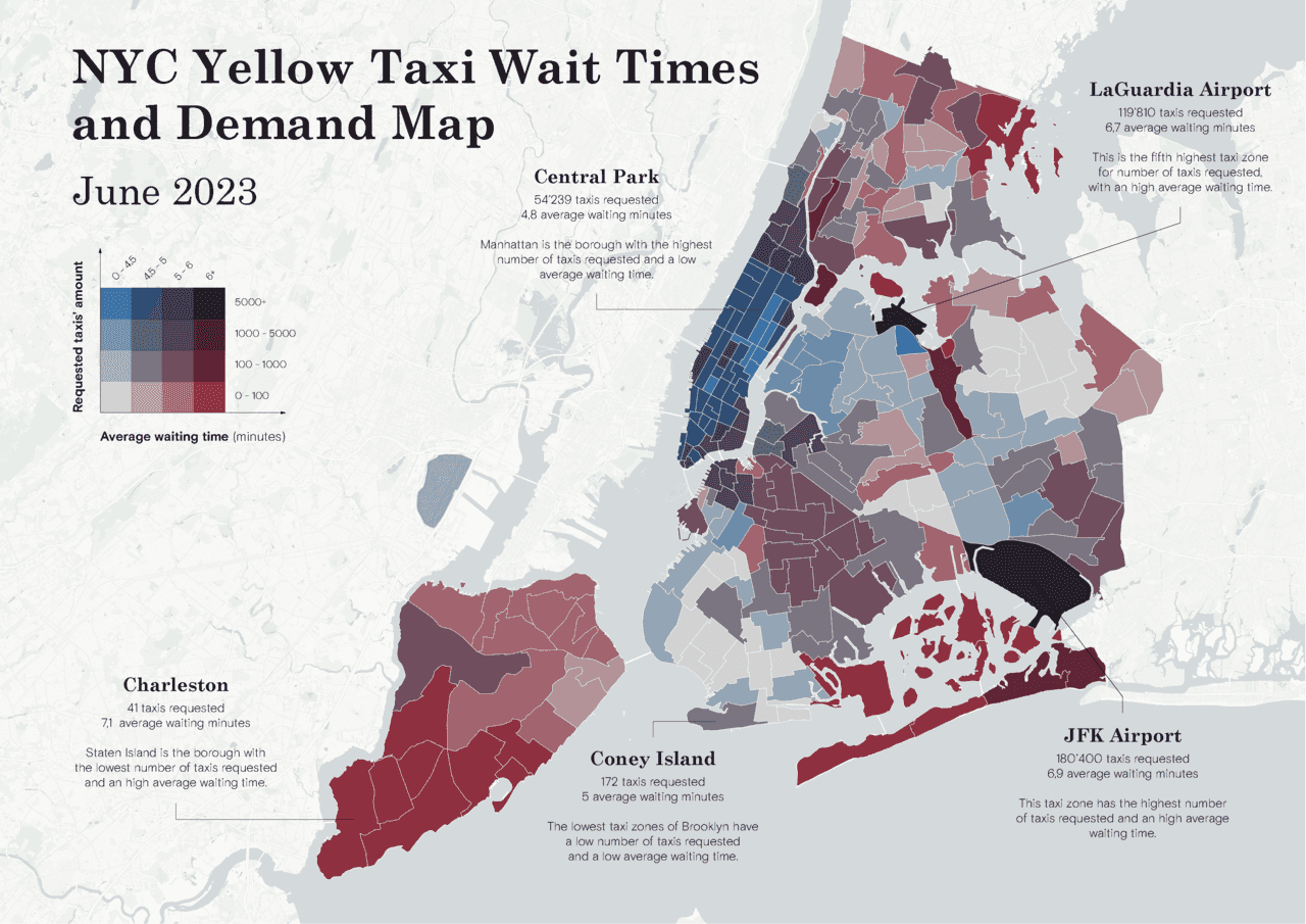
Bivariate choropleth map showing average wait times and number of yellow taxi requests in NYC by zone (June 2023). Author: Lucoooo, created with QGIS. Licensed under CC BY-SA 4.0.
- A map showing median income and high school graduation rate in each county, using blended color schemes.
- A housing map combining rental cost and commute time to identify areas with poor affordability.
- A map comparing internet access and poverty levels to highlight digital divides.
- Enables multivariate spatial analysis in a single visual.
- Helps reveal correlations or contrasts between two related datasets.
- Saves space and avoids splitting attention across two maps.
- Harder to read and interpret, especially for general audiences.
- Requires a clear and intuitive legend to be useful.
- Color combinations may be challenging for accessibility (e.g., color blindness).
Isoline Maps
Isoline maps use continuous lines to connect points with equal values of a specific variable. These lines — known as isolines — help visualize how that variable changes across space. Common types include isotherms (equal temperature), isobars (equal atmospheric pressure), and contour lines (equal elevation).
When isolines are drawn from precise point measurements (like weather stations), it's called an isoline map. If the values represent averaged data across regions (like population density), it's referred to as an isopleth map — a closely related but distinct type.
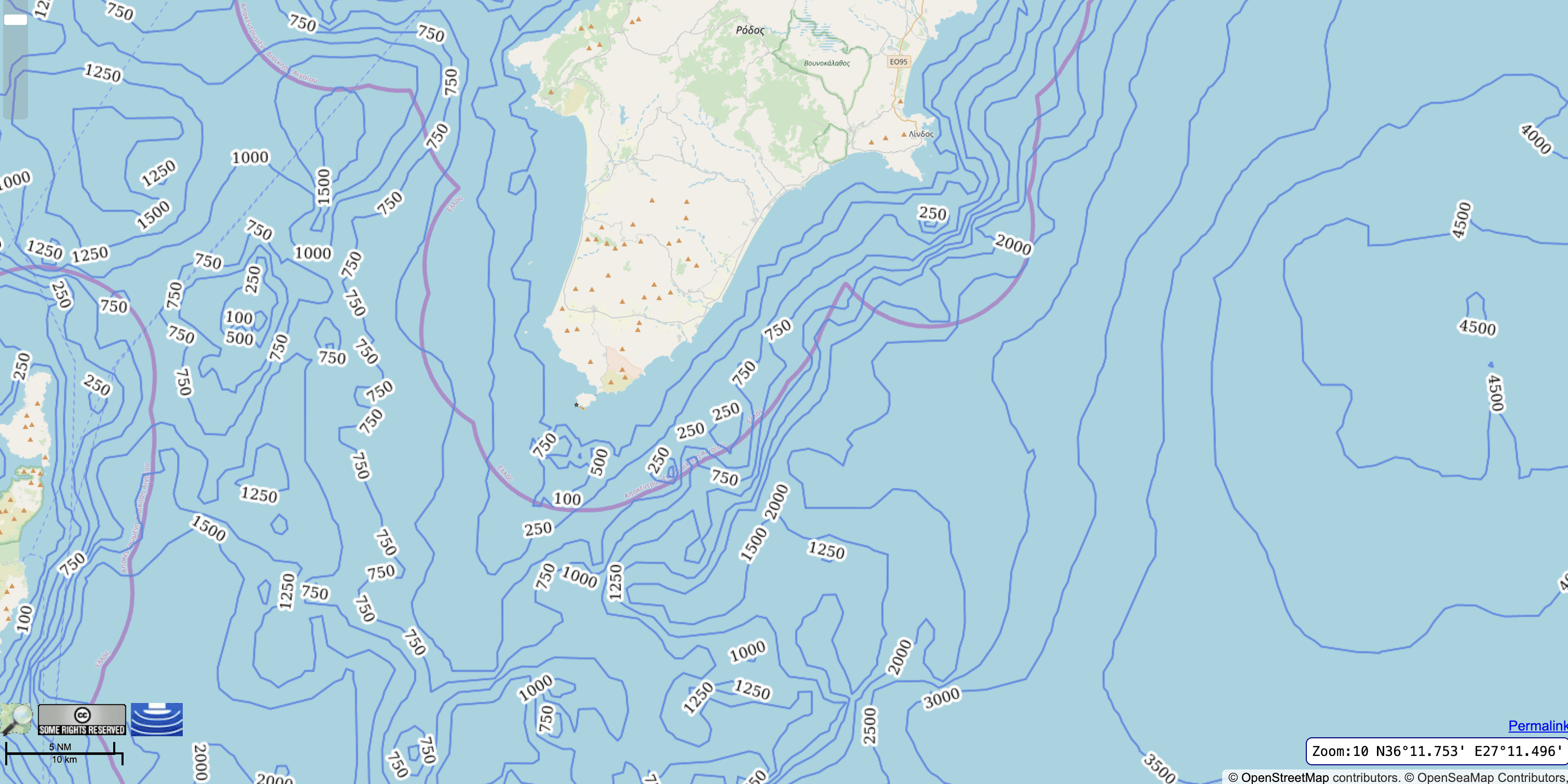
Water depth around the island of Rhodes visualized with contour-like isolines. Map data © OpenSeaMap, under the Open Database License (ODbL).
- A topographic map showing terrain elevation with closely spaced contour lines in mountainous areas.
- A weather map using isobars to indicate high and low-pressure zones.
- A wind speed map where isotachs connect regions with equal wind velocity.
- A noise map illustrating equal decibel levels around an airport or highway.
If you're interested in travel-based isolines, Geoapify Isochrone Maps offer an intuitive way to show how far someone can travel within a set time or distance from a point. You can also use the Isoline API to generate isochrones (travel time areas) and isodistances (travel distance areas) using various transport modes and constraints.
- Ideal for displaying gradual, continuous changes in spatial data.
- Great for highlighting patterns, boundaries, and transitional zones.
- Widely used in scientific, environmental, and engineering applications.
- Requires dense and accurate point data for reliable results.
- Can be challenging to interpret for non-experts.
- May become visually cluttered in areas with rapid or extreme data variation.
- Results can be too rough or generalized if data is sparse or unevenly distributed.
Isopleth Maps
Isopleth maps are used to represent continuous phenomena that vary across space — such as population density, rainfall, or air pollution. These maps use shaded regions or filled contours to illustrate areas with similar values, helping to visualize gradients and transitions in the data.
Isopleths are often derived from interpolated data and show values that are distributed throughout an area, not just at specific points. They're commonly used when data is aggregated (e.g., per square kilometer) or smoothed over a surface.
Isopleth vs. Isoline
- Isolines are lines that connect points of equal value — such as elevation or temperature. These maps typically show only the lines.
- Isopleths use those isolines to create filled regions between the lines, often with a color gradient to represent value ranges. In short: Isolines show the lines, while isopleths show the regions between them.
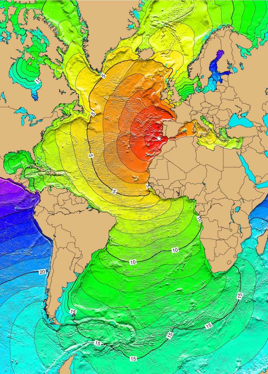
Estimated tsunami travel times from the 1755 Lisbon earthquake (red: 1–4h, yellow: 5–6h, green: 7–14h, blue: 15–21h); source: NOAA NGDC, public domain.
- A population density map highlighting urban-to-rural transitions using smoothed color gradients.
- A median household income map showing gradual economic variation across neighborhoods.
- A crop productivity map identifying high- and low-yield agricultural zones.
- A climate index map visualizing comfort zones based on temperature and humidity.
- A disease vulnerability map estimating relative risk across a country based on healthcare data and demographics.
- Ideal for visualizing smooth spatial patterns in continuous or averaged data.
- Makes it easier to identify regions with similar characteristics.
- Works well with statistical, environmental, and demographic data.
- May hide localized extremes due to averaging or smoothing.
- Needs careful interpolation to avoid distortions.
- Often confused with isoline maps, especially when visual styles are similar.
- Less precise for point-specific data, as it generalizes over areas.
Heat Maps
Heat maps are thematic maps that use color intensity or gradients to represent the density or intensity of a phenomenon across a surface. They are typically raster-based and do not rely on administrative boundaries — making them ideal for visualizing data that occurs irregularly or continuously in space.
Unlike choropleth or dot density maps, heat maps interpolate values based on proximity and concentration, resulting in smoothed visual gradients that highlight hotspots and cold zones.
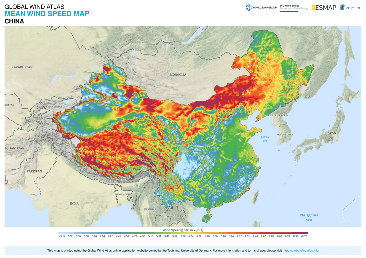
Mean wind speed in China from the Global Wind Atlas. Source: Global Wind Atlas, licensed under CC BY 4.0.
- A crime heat map of a city, with red areas indicating high incident concentration.
- A retail footfall map showing customer density around shopping centers.
- An air quality heat map based on sensor networks across a region.
- A bike-sharing activity map displaying usage intensity across urban stations.
- Very effective at showing concentration or intensity without requiring boundaries.
- Ideal for point-based or location event data (e.g., GPS, sensors, logs).
- Visually intuitive and engaging for general audiences.
- Can distort actual values — intensity may be influenced by clustering or scaling method.
- Not suitable for exact or comparative analysis (values are not precise).
- May over-smooth or exaggerate hotspots depending on the chosen parameters.
Dot-Density Maps
Dot-density maps use dots to represent a quantity of a variable within a defined area. Each dot corresponds to a specific number of occurrences (e.g., one dot = 1,000 people), and the distribution of dots visually conveys how the data is spread across space.
These maps are especially useful for showing absolute counts and distributions rather than ratios or densities. They don’t show exact locations of individual events or people, but rather illustrate spatial patterns based on data aggregated by regions.
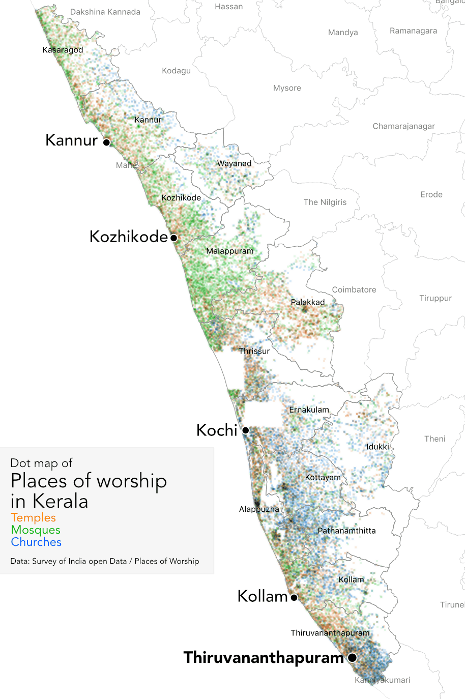
Dot distribution map showing places of worship in Kerala, India — one of the most religiously diverse states in the country. Source: Survey of India Open Data. Author: Planemad, licensed under CC BY-SA 4.0.
- A U.S. population map, where each dot represents 1,000 people, dispersed to reflect urban and rural densities.
- A crop distribution map, with dots showing wheat farms across agricultural zones.
- A disease outbreak map, using dots to represent reported cases by region.
- A refugee movement map, displaying displaced individuals by host regions.
- Great for visualizing absolute numbers and spatial distribution.
- Easy to understand and interpret visually.
- Does not require complex classification or interpolation.
- Can be misleading if dots overlap heavily or are randomly placed within large areas.
- Not ideal for small value differences — hard to detect subtle variation.
- Dot placement is usually randomized within a polygon, not precise.
Size Theme / Graduated Symbol Maps
Graduated symbol maps (also known as size theme maps) use symbols of varying size — typically circles — to represent quantitative values at specific geographic locations. The size of each symbol is scaled proportionally (or semi-proportionally) to the data value, making it easy to compare magnitudes across locations.
These maps are especially effective for point-based data, such as city populations, event counts, or production volumes. They’re ideal when you want to highlight absolute values rather than ratios or densities.
Terminology note: “Graduated symbol map” is the standard term in cartography and GIS tools, while “size theme map” is a more informal name that refers to the same concept.
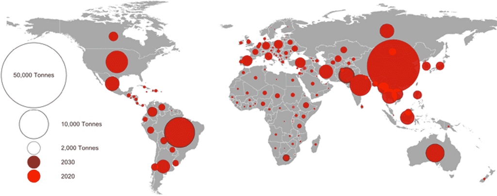
Graduated symbol map showing antimicrobial use in 2020 (red circles) and projected increase by 2030 (dark red rings). Source: PLOS Global Public Health, licensed under CC BY 4.0.
- A city population map, where larger circles indicate more residents.
- An earthquake magnitude map with symbols sized according to Richter scale values.
- An airport map showing passenger volumes with graduated circles.
- A refugee map where symbol size represents the number of displaced people hosted in each region.
- Excellent for comparing absolute values between locations.
- Easy to understand and visually engaging.
- Works well on both small and large geographic scales.
- Can be difficult to interpret exact values without a clear legend.
- Overlapping symbols may obscure data in densely populated areas.
- Not suitable for normalized data (e.g., rates or percentages).
Cartograms
Cartograms are thematic maps in which geographic regions are resized or distorted based on a specific variable, rather than their actual land area. The shape and relative position of regions may be preserved (in some types) or altered to prioritize data representation over geographic accuracy. Cartograms are powerful for showing comparative quantities in a visually impactful way — for example, emphasizing countries with larger populations, economies, or carbon emissions regardless of their physical size.
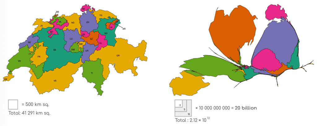
Cartogram showing market capitalisation of publicly listed firms in Switzerland, aggregated by canton of registered office. Author: Sdnegel, licensed under CC BY-SA 4.0
- Contiguous cartograms: Maintain shared borders between regions but distort shape (e.g., squashed or stretched countries).
- Non-contiguous cartograms: Maintain original shapes but allow regions to shrink or expand independently, creating space between them.
- Dorling cartograms: Replace regions with scaled circles, often positioned to resemble the original geography.
- A world population cartogram where densely populated countries (like India or China) appear much larger.
- A US election results cartogram scaled by number of voters or electoral votes instead of state size.
- A carbon footprint map where countries are resized according to their CO₂ emissions.
- A global vaccination coverage map showing doses administered, not landmass.
- Highly effective at drawing attention to disparities in data.
- Excellent for showing comparative values (e.g., who contributes most or least).
- Memorable and eye-catching for communication and storytelling.
- Distorts geographic accuracy, which can confuse some viewers.
- Harder to interpret spatial relationships like distance or adjacency.
- May be less familiar to general audiences than standard map types.
Tools & Platforms to Create Thematic Maps
From beginner-friendly editors to advanced GIS platforms.
You can build thematic maps with a wide range of tools — whether you're a developer, analyst, educator, or journalist. Below are both no-code and low-code platforms suited for different needs and experience levels.
No-Code Mapping Tools (No Programming Required)
These tools let you upload your data and visually build thematic maps — ideal for users who don’t want to write code.
Recommended Platforms:
-
Mapifator A no-code thematic map builder by Geoapify. Create interactive maps with custom icons, filters, and storytelling features.
-
Datawrapper Great for journalists and educators. Supports choropleths, symbol maps, and more with just a CSV file and a few clicks.
-
Flourish Powerful visualization tool with templates for choropleths, tile maps, symbol maps, and animated storytelling — all no-code.
-
ArcGIS Online ESRI’s browser-based platform for creating interactive maps using templates and data layers — no code required for most use cases.
-
CARTO Builder A cloud GIS tool offering an intuitive drag-and-drop interface for building choropleth and bivariate maps. Advanced users can add SQL queries or scripts, but basics require no code.
Best for: Educators, journalists, NGOs, marketers, and analysts.
Low-Code / Advanced Tools (For Developers and Analysts)
These tools provide more power and flexibility but assume some level of coding or GIS expertise.
Recommended Platforms:
-
QGIS Open-source GIS software for professional users. Supports all thematic map types but has a learning curve and scripting options (Python, SQL).
-
Mapbox Studio Vector styling tool for creating custom basemaps and map layers. Styling requires understanding of Mapbox expressions.
-
Kepler.gl High-performance web-based map builder by Uber. Excellent for large datasets and time-based visualizations. Some technical knowledge recommended.
-
Tableau Visual analytics platform with strong mapping support — great for symbol and filled maps. Advanced use cases involve calculated fields or GIS integration.
-
Power BI Business analytics tool with mapping capabilities. Supports shape maps, ArcGIS integration, and custom visuals — works best with structured spatial data.
-
Leaflet and MapLibre JavaScript libraries for building fully custom interactive maps. Requires coding, but offer maximum control and integration with Geoapify services.
Best for: Developers, GIS analysts, data visualization experts, and projects requiring full customization or interactivity.
Power Your Maps with Geoapify APIs
Combine your preferred tool with Geoapify services for better data and map functionality:
- Map Tiles – Add clean, customizable base layers.
- Boundaries API – Retrieve administrative and regional polygons for choropleths and region-based maps.
- Isoline API – Generate travel-time and distance zones for isochrones, accessibility, and logistics maps.
- Place Details API – Get detailed POI metadata and original boundary geometry to enrich your thematic maps.
Conclusion
Thematic maps are more than just visuals — they are powerful tools for understanding data in a spatial context. Whether you're analyzing population trends, exploring environmental impacts, or building interactive dashboards, choosing the right map type helps turn raw data into clear insights.
With a growing ecosystem of no-code and developer-friendly tools, it's easier than ever to create professional, meaningful maps for any audience or use case.
Ready to build your own thematic map?
Start by exploring our Map Tiles as a base layer, and enhance your maps with APIs like the Boundaries API and Isoline API. Whether you're coding or not, Geoapify provides everything you need to bring your data to life.
→ Explore Geoapify Tools and start mapping today!
FAQ
Which type of thematic map is best for visualizing population density?
Population density is typically visualized using choropleth maps for regional comparisons or dot-density maps when you want to show detailed spatial distribution.
How can I improve map performance when loading large datasets?
To improve performance, use simplified geometry (e.g., reduced polygon detail) when rendering large boundary datasets. You can simplify features in a GIS tool or request simplified results from APIs such as the Geoapify Boundaries API.
Do I need to provide attribution when using Geoapify APIs or map tiles?
Yes, attribution is required, especially on the Free plan. Include a visible mention like: <a href="https://www.geoapify.com/" target="_blank" >Powered by Geoapify</a>. Attribution to OpenStreetMap is also required where applicable.
Can I visualize my own data on Geoapify map tiles?
Yes, you can overlay your own or third-party data on top of Geoapify map tiles using libraries like Leaflet, MapLibre, or QGIS. This allows you to build fully customized thematic maps with your data.
How can I create a thematic map without programming?
You can use no-code tools like Mapifator, QGIS, or Datawrapper. These platforms let you upload your data and build interactive maps using visual editors, without writing a single line of code.
Can I use Leaflet or MapLibre to build custom thematic maps?
Yes, both Leaflet and MapLibre are excellent open-source JavaScript libraries for building custom, interactive thematic maps. You can combine them with Geoapify APIs and Map Tiles for full flexibility.
Where can I get country, state, or city boundaries for choropleth maps?
Use the Geoapify Boundaries API to get administrative and political boundary polygons for countries, regions, cities, and more. It’s perfect for generating choropleth and region-based maps.
How can I generate travel-time zones for accessibility or service area maps?
Geoapify offers an Isoline API that allows you to generate isochrones (travel-time areas) and isodistances based on driving, walking, biking, and public transit.
How can I enrich my thematic map with details about specific places?
Use the Place Details API to retrieve additional information about places, such as POI metadata, categories, and original boundary geometry. This is helpful for adding context or interactivity to your map.
Can I combine multiple Geoapify APIs in one map?
Yes, and it's encouraged! For example, you can combine Map Tiles for your base layer, Boundaries API for regions, Isoline API for accessibility zones, and Place Details API for interactive popups — all within the same map interface.