


In this article, I'll show how to create a map-based visualization of multi-dimensional data - time, location, and value. A time series map is a visualization that represents changes in data over time at specific geographic locations, helping users analyze patterns, trends, and movement. As an example, I'm going to use the public daily statistics for the nCoV-2019 “coronavirus” outbreak.
By the end of January 2020, the “coronavirus” outbreak started to become one of the top world concerns. Despite the high amount of information that authorities and news agencies provide every day, it is surprisingly hard to see the big picture behind all those numbers.
As most situational data, virus outbreak numbers have a clear location component. Therefore map-based visualization can be extremely helpful.
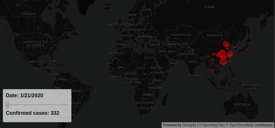
We're going to take the raw data and create a simple web-based dashboard that looks like this:
Preparing time series data
As the first step, I took the daily statistics data kindly made available here by the Center for Systems Science and Engineering at John Hopkins University.
Raw data were normalized, aggregated by date and geocoded with Geoapify Geocoding API. For convenience, the resulting data for each day were represented in the GeoJSON format, that looks like this:
{
        "type": "FeatureCollection",
        "features": [{
          "type": "Feature",
          "geometry": {
            "type": "Point",
            "coordinates": [121.4554, 31.20327]
          },
          "properties": {
            "Place": "Shanghai",
            "Confirmed": 9
          }
        },
        ...
}
Configuring time series map
As the next step, I created a simple webpage with Mapbox GL data visualization library, "dark" basemap and two layers - "case-circles" and "case-labels". Both layers configured to use the GeoJSON data source and dynamically take the number of confirmed cases from each GeoJSON Feature "properties.Confirmed" field.
// please get your own free ApiKey at https://myprojects.geoapify.com
var geoapifyApiKey = 'YOUR_API_KEY';

var map = new mapboxgl.Map({
  container: 'map',
  style: `https://maps.geoapify.com/v1/styles/dark-matter/style.json?apiKey=${geoapifyApiKey}`,
  center: [15, 21],
  refreshExpiredTiles: false,
  zoom: 1.1
});

map.on('load', function() {
  map.addSource('cases', {
    'type': 'geojson',
    data: null
  });

  map.addLayer({
    'id': 'case-circles',
    'type': 'circle',
    'source': 'cases',
    'paint': {
      'circle-color': '#FF0000',
      'circle-opacity': 0.5,
      'circle-radius': [
        'interpolate',
        ["exponential", 0.9],
        ['get', 'Confirmed'],
        1,
        5,
        5000,
        15
      ]
    }
  });

  map.addLayer({
    'id': 'case-labels',
    'type': 'symbol',
    'source': 'cases',
    'layout': {
      'text-field': [
        'to-string', ['get', 'Confirmed']
      ],
      'text-font': [
        'Open Sans Bold',
        'Arial Unicode MS Bold'
      ],
      'text-size': 12
    },
    'paint': {
      'text-color': 'rgba(0,0,0,0.5)'
    }
  });
});
Due to the significant difference in the number of confirmed cases per location, the "case-circles" layer was configured to use an exponential scale, to emphasize new locations as they appear on the map.
Adding Slider to a Map For Interactivity
Additionally, I've added the date slide that triggers map update accordingly to the selected date and allows to see outbreak dynamics.
<div class="map-overlay top">
    <div class="map-overlay-inner">
        <h2 id="date"></h2>
        <input id="slider" type="range" min="0" max="1" step="1" value="0" />
        <h2 id="count">Confirmed cases</h2>
    </div>
</div>

<script>
var casesHistory = getCasesHistory()
var dates = Object.keys(casesHistory)

document.getElementById('slider').max = dates.length - 1

function updateMap(dateId) {
  var date = dates[dateId]
  var casesForDate = casesHistory[date]
  document.getElementById('date').textContent = `Date: ${date}`;
  document.getElementById('count').textContent = `Confirmed cases: ${casesForDate.total}`;
  map.getSource('cases').setData(casesForDate.geojson);
}

document
  .getElementById('slider')
  .addEventListener('input', function(e) {
    var dateId = parseInt(e.target.value, 10);
    updateMap(dateId);
});

updateMap(0);
</script>
Going further
I hope that you now have the general idea of how to create time series maps. To make it easier, I've prepared a free JSFiddle example to help you get started.
Still too complicated? Don't worry, and get in touch with us. We'll be happy to help you with your project.
Besides time series maps and outbreaks data visualizations Geoapify offers a variety of other mapping solutions for the public health care sector.
What's Next?
- Learn more about Map animation with Mapbox GL
- Check out our A Step-by-Step Tutorial to Build Heatmaps with MapLibre GL


