


Address Inputs are used to collect, verify, and validate addresses on your website. Unfortunately, entering address data can be a real pain. When inputting an address, there are often misspellings and mistakes. Moreover, just an address is not always enough. Often you also need geographical coordinates and other information to display a map or address someone appropriately.
In this tutorial, we’ll show you how to implement address input forms. So you will be able to collect and verify your customer’s addresses easily and effectively.
Getting Address Suggestions when a user types
How do you make sure the address input by users is valid? The answer is Address Suggestions! Address suggestions help customers select the correct address in a set of proposals.
Address Autocomplete API is a simple way to get suggestions for an address string entered by a user. The API returns the most likely address that the user was thinking of.
For example, if a customer starts to type and enters "rue de la defe", he will already get suggestions that help him choose the address:
- Rue de la Défense, Montreuil, France
- Rue de la Défense, Dakar, Senegal
- Rue de la Défense, Issy-les-Moulineaux, France
- Rue de la Deferlante, LAiguillon-sur-Vie, France
- Rue de la Défense, Bernay, France
A real-life demo of Address Input field:
The input accepts the entire address in the demo above. However, with Geoapify Autocomplete API you can implement separate address fields: country, city, postal code, street, number of the house.
Implementing Address Input form
We will call the API to query suggestions when the user types or enters an address into an input. It's not strictly necessary, but it also does make sense to wait for an interval after the user stops typing before calling the API. This will prevent unnecessary API activity and improve web app performance.
After the API returns address suggestions, we'll display them in a list or drop-down menu and let the user choose the correct one.
Let's visualize the process in an easy-to-follow flowchart to make the algorithm more clear:
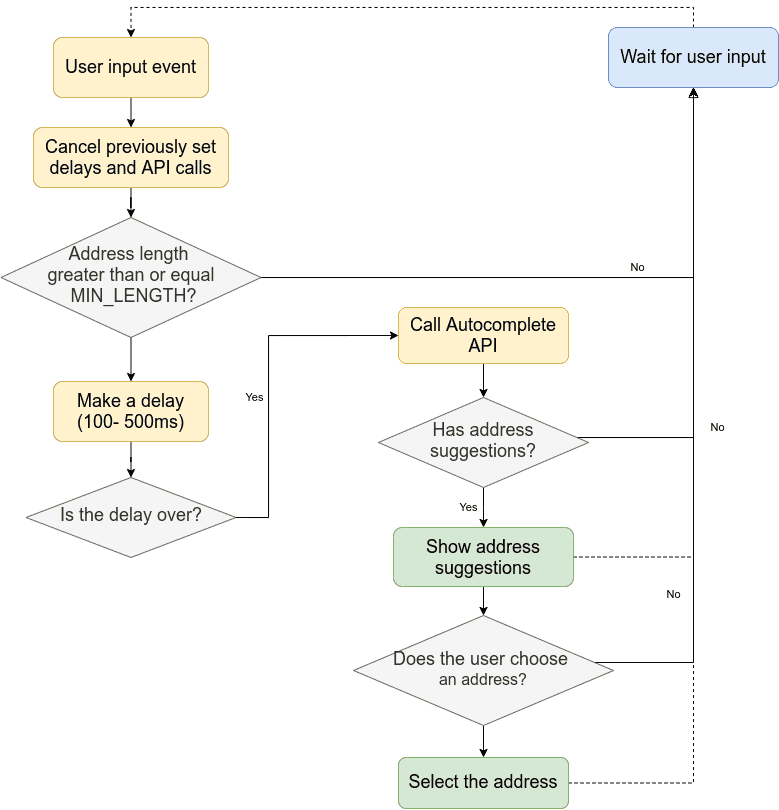
Note that the user can continue typing at any time. As a developer, you should always expect to have new user input and plan for that.
Address Input with JavaScript
Now let's develop an address form using HTML and JavaScript to capture a single input field for a user’s address.
We've created these individual steps to help you implement the address autocomplete functionality. Here at JSFiddle you can find the full version of the code.
Step 1. Create an HTML input field
To be more self-supporting and not to depend on the CSS property of parent containers too much, we will generate an address input field inside the provided container.
HTML
<div class="autocomplete-container" id="autocomplete-container"></div>CSS
.autocomplete-container {
  margin-bottom: 20px;
}

.input-container {
  display: flex;
}

.input-container input {
  flex: 1;
  outline: none;

  border: 1px solid rgba(0, 0, 0, 0.2);
  padding: 10px;
  padding-right: 31px;
  font-size: 16px;
}
The new addressAutocomplete() method will add an input with address autocomplete functionality. The method accepts a callback function and options as input parameters.
JavaScript
function addressAutocomplete(containerElement, callback, options) {
	// create container for input element
  const inputContainerElement = document.createElement("div");
  inputContainerElement.setAttribute("class", "input-container");
  containerElement.appendChild(inputContainerElement);

  // create input element
  const inputElement = document.createElement("input");
  inputElement.setAttribute("type", "text");
  inputElement.setAttribute("placeholder", options.placeholder);
  inputContainerElement.appendChild(inputElement);
}

addressAutocomplete(document.getElementById("autocomplete-container"), (data) => {
  console.log("Selected option: ");
  console.log(data);
}, {
	placeholder: "Enter an address here"
});
Step 2. Listen for a user input and call Address Autocomplete API
Here, we'll call the Autocomplete API every time the user inputs something. It's essential to cancel previous calls when on new input. This way, we can prevent unnecessary API calls and UI updates.
JavaScript
function addressAutocomplete(containerElement, callback, options) {
  ...

  const MIN_ADDRESS_LENGTH = 3;
  const DEBOUNCE_DELAY = 300;

  /* Process a user input: */
  inputElement.addEventListener("input", function(e) {
    const currentValue = this.value;

    // Cancel previous timeout
    if (currentTimeout) {
      clearTimeout(currentTimeout);
    }

    // Cancel previous request promise
    if (currentPromiseReject) {
      currentPromiseReject({
        canceled: true
      });
    }

    // Skip empty or short address strings
    if (!currentValue || currentValue.length < MIN_ADDRESS_LENGTH) {
      return false;
    }

    /* Call the Address Autocomplete API with a delay */
    currentTimeout = setTimeout(() => {
    	currentTimeout = null;

      /* Create a new promise and send geocoding request */
      const promise = new Promise((resolve, reject) => {
        currentPromiseReject = reject;

        // Get an API Key on https://myprojects.geoapify.com
        const apiKey = "YOUR_API_KEY";

        var url = `https://api.geoapify.com/v1/geocode/autocomplete?text=${encodeURIComponent(currentValue)}&format=json&limit=5&apiKey=${apiKey}`;

        fetch(url)
          .then(response => {
            currentPromiseReject = null;

            // check if the call was successful
            if (response.ok) {
              response.json().then(data => resolve(data));
            } else {
              response.json().then(data => reject(data));
            }
          });
      });

      promise.then((data) => {
        // here we get address suggestions
        console.log(data);
      }, (err) => {
        if (!err.canceled) {
          console.log(err);
        }
      });
    }, DEBOUNCE_DELAY);
  });
}
Step 3. Show address suggestions in a drop-down list
We will show address suggestions in an absolutely positioned <div> element. We need to show the element when there are address suggestions and hide on new user input.
JavaScript
function addressAutocomplete(containerElement, callback, options) {
  ...

  /* Current autocomplete items data */
  var currentItems;

  /* Process a user input: */
  inputElement.addEventListener("input", function(e) {
    ...

    /* Call the Address Autocomplete API with a delay */
    currentTimeout = setTimeout(() => {
      ...
      promise.then((data) => {
        // here we get address suggestions
        currentItems = data.results;

        /*create a DIV element that will contain the items (values):*/
        const autocompleteItemsElement = document.createElement("div");
        autocompleteItemsElement.setAttribute("class", "autocomplete-items");
        inputContainerElement.appendChild(autocompleteItemsElement);

        /* For each item in the results */
        data.results.forEach((result, index) => {
          /* Create a DIV element for each element: */
          const itemElement = document.createElement("div");
          /* Set formatted address as item value */
          itemElement.innerHTML = result.formatted;
          autocompleteItemsElement.appendChild(itemElement);
        });

      }, (err) => {
        if (!err.canceled) {
          console.log(err);
        }
      });
    }, DEBOUNCE_DELAY);
  });

  function closeDropDownList() {
    var autocompleteItemsElement = inputContainerElement.querySelector(".autocomplete-items");
    if (autocompleteItemsElement) {
      inputContainerElement.removeChild(autocompleteItemsElement);
    }
  }
}
We need to set the position of parent element to relative so that the drop-down box becomes visible:
CSS
.input-container {
  ...
  position: relative;
}


.autocomplete-items {
  position: absolute;
  border: 1px solid rgba(0, 0, 0, 0.1);
  box-shadow: 0px 2px 10px 2px rgba(0, 0, 0, 0.1);
  border-top: none;
  background-color: #fff;

  z-index: 99;
  top: calc(100% + 2px);
  left: 0;
  right: 0;
}

.autocomplete-items div {
  padding: 10px;
  cursor: pointer;
}

.autocomplete-items div:hover {
  /*when hovering an item:*/
  background-color: rgba(0, 0, 0, 0.1);
}
Step 4. Choose an address suggestion on click and notify
Next, we'll add a click event listener to the address suggestions elements. When any address is clicked, we will close the drop-down.
We've already added the callback function to the autocomplete. So all we need to do now is trigger the event:
JavaScript
function addressAutocomplete(containerElement, callback, options) {

  ...

  /* Process a user input: */
  inputElement.addEventListener("input", function(e) {

    ...

    /* Call the Address Autocomplete API with a delay */
    currentTimeout = setTimeout(() => {
      ...

      promise.then((data) => {

        ...

        /* For each item in the results */
        data.results.forEach((result, index) => {

          ...

          /* Set the value for the autocomplete text field and notify: */
          itemElement.addEventListener("click", function(e) {
            inputElement.value = currentItems[index].formatted;
            callback(currentItems[index]);
            /* Close the list of autocompleted values: */
            closeDropDownList();
          });
        });

      }, (err) => {
        if (!err.canceled) {
          console.log(err);
        }
      });
    }, DEBOUNCE_DELAY);
  });

  ...
}
Step 5. Choose an address suggestion on keypress
Now a user can choose an address. But you probably noticed that it's not always convenient to make it with a mouse click. So let's add support for key events to improve a customer experience.
Depending on the current state of the drop-down box, we will add the following functionality:
- When the drop-down box is hidden, pressing the down arrow will show it again previous entries;
- When the drop-down box is visible, pressing the down arrow will choose the next suggestion;
- When the drop-down box is visible, pressing the up arrow will choose the previous suggestion;
- When the drop-down box is visible, pressing the enter button will hide the drop-down.
We will save the focused item index to navigate the suggestions and highlight the current one:
JavaScript
function addressAutocomplete(containerElement, callback, options) {
  ...

  /* Focused item in the autocomplete list. This variable is used to navigate with buttons */
  let focusedItemIndex;

  /* Add support for keyboard navigation */
  inputElement.addEventListener("keydown", function(e) {
    var autocompleteItemsElement = containerElement.querySelector(".autocomplete-items");
    if (autocompleteItemsElement) {
      var itemElements = autocompleteItemsElement.getElementsByTagName("div");
      if (e.keyCode == 40) {
        e.preventDefault();
        /*If the arrow DOWN key is pressed, increase the focusedItemIndex variable:*/
        focusedItemIndex = focusedItemIndex !== itemElements.length - 1 ? focusedItemIndex + 1 : 0;
        /*and and make the current item more visible:*/
        setActive(itemElements, focusedItemIndex);
      } else if (e.keyCode == 38) {
        e.preventDefault();

        /*If the arrow UP key is pressed, decrease the focusedItemIndex variable:*/
        focusedItemIndex = focusedItemIndex !== 0 ? focusedItemIndex - 1 : focusedItemIndex = (itemElements.length - 1);
        /*and and make the current item more visible:*/
        setActive(itemElements, focusedItemIndex);
      } else if (e.keyCode == 13) {
        /* If the ENTER key is pressed and value as selected, close the list*/
        e.preventDefault();
        if (focusedItemIndex > -1) {
          closeDropDownList();
        }
      }
    } else {
      if (e.keyCode == 40) {
        /* Open dropdown list again */
        var event = document.createEvent('Event');
        event.initEvent('input', true, true);
        inputElement.dispatchEvent(event);
      }
    }
  });

  function setActive(items, index) {
    if (!items || !items.length) return false;

    for (var i = 0; i < items.length; i++) {
      items[i].classList.remove("autocomplete-active");
    }

    /* Add class "autocomplete-active" to the active element*/
    items[index].classList.add("autocomplete-active");

    // Change input value and notify
    inputElement.value = currentItems[index].formatted;
    callback(currentItems[index]);
  }

  function closeDropDownList() {
    ...
    focusedItemIndex = -1;
  }
}
Make the address is highlighted when it has been focused:
CSS
.autocomplete-items .autocomplete-active {
  /*when navigating through the items using the arrow keys:*/
  background-color: rgba(0, 0, 0, 0.1);
}
The main functionality for the address input form is done. But let's add a few small features to make it easier for the user.
Step 6. Clear address button
Now the user can clear the address input box with a keyboard only. It would be great if he could push a button to remove the address. Let's add it! We will use Google Material Icon for the clear button.
JavaScript
function addressAutocomplete(containerElement, callback, options) {
  ...

  // add input field clear button
  const clearButton = document.createElement("div");
  clearButton.classList.add("clear-button");
  addIcon(clearButton);
  clearButton.addEventListener("click", (e) => {
    e.stopPropagation();
    inputElement.value = '';
    callback(null);
    clearButton.classList.remove("visible");
    closeDropDownList();
  });
  inputContainerElement.appendChild(clearButton);

  /* Process a user input: */
  inputElement.addEventListener("input", function(e) {

    if (!currentValue) {
      clearButton.classList.remove("visible");
    }

    // Show clearButton when there is a text
    clearButton.classList.add("visible");

    ...
  });

  function addIcon(buttonElement) {
    const svgElement = document.createElementNS("http://www.w3.org/2000/svg", 'svg');
    svgElement.setAttribute('viewBox', "0 0 24 24");
    svgElement.setAttribute('height', "24");

    const iconElement = document.createElementNS("http://www.w3.org/2000/svg", 'path');
    iconElement.setAttribute("d", "M19 6.41L17.59 5 12 10.59 6.41 5 5 6.41 10.59 12 5 17.59 6.41 19 12 13.41 17.59 19 19 17.59 13.41 12z");
    iconElement.setAttribute('fill', 'currentColor');
    svgElement.appendChild(iconElement);
    buttonElement.appendChild(svgElement);
  }
}
The button will appear if there is an address. In addition, we will highlight the button when the user hovers on it:
CSS
.clear-button {
  color: rgba(0, 0, 0, 0.4);
  cursor: pointer;

  position: absolute;
  right: 5px;
  top: 0;

  height: 100%;
  display: none;
  align-items: center;
}

.clear-button.visible {
  display: flex;
}

.clear-button:hover {
  color: rgba(0, 0, 0, 0.6);
}
Step 7. Close the dropdown when the user clicks outside the area
Let’s close the options list whenever someone clicks outside it. We will listen for the document’s click events and call closeDropDownList() method to hit the drop-down.
JavaScript
function addressAutocomplete(containerElement, callback, options) {
  ...

  /* Close the autocomplete dropdown when the document is clicked.
      Skip, when a user clicks on the input field */
  document.addEventListener("click", function(e) {
    if (e.target !== inputElement) {
      closeDropDownList();
    } else if (!containerElement.querySelector(".autocomplete-items")) {
      // open dropdown list again
      var event = document.createEvent('Event');
      event.initEvent('input', true, true);
      inputElement.dispatchEvent(event);
    }
  });
}
Conclusion
We've created an Address Input form with autocomplete functionality in this tutorial. You can easily extend and improve the existing code to make it more useful for you. The code is open for everyone to see, comment on, extend, or personalize.
The Autocomplete API accepts location type as a parameter, so you can create separate address fields when it's needed. For example, this might be useful for address validation and verification forms.
In addition, we made the Address Autocomplete functionality available as NPM packages, including components for ReactJS and Angular.
What's next
- Learn more about the Geoapify Address Autocomplete API >>
- Try the API with the Address Autocomplete API Playground >>
- Learn more about our Address Lookup API & Address Validation/Verification API
- Learn more about address validation process and tools you can use for address verification in our guide
- Want to add places to autocomplete? See Address Autocomplete with Built-In Places Support >>